
Typography is one of those elements that most people feel but rarely stop to analyze. You land on a website, read a headline, or pick up a brand brochure, and within seconds you have already formed an opinion. Not about the words. About how those words look. That instant reaction is the silent power of fonts, and it shapes trust, attention, and perception faster than almost any other design decision a creator can make.
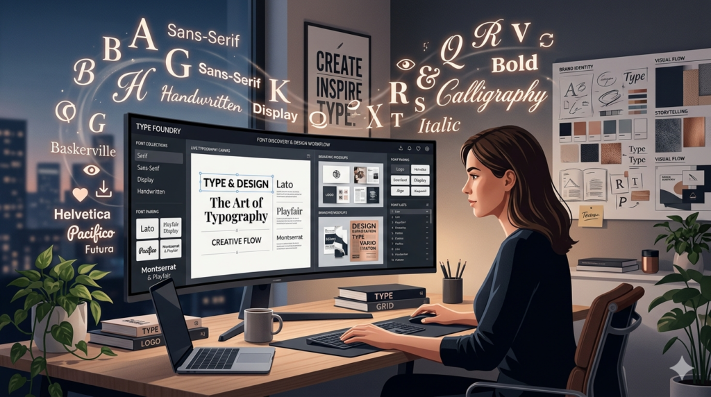
The problem is not a shortage of fonts. If anything, the opposite is true. Thousands of typefaces exist across dozens of platforms, and navigating that volume without a clear system leads to wasted hours, inconsistent choices, and creative fatigue. This is the exact problem that modern font discovery tools are built to solve, and it is where a platform like fontlu steps in to change how designers, business owners, and content creators approach their typography workflow.
Why Font Decisions Carry More Weight Than You Think
Most people treat font selection as a finishing touch, something to handle after the real work is done. That mindset is costly. Research in cognitive psychology consistently shows that people form judgments about a brand or piece of content within milliseconds of seeing text. The typeface is not decoration. It is the first signal your audience receives about who you are and whether you can be trusted.
Serif fonts carry a quiet authority. They feel established, formal, and credible, which is why financial institutions and editorial publications have leaned on them for generations. Sans-serif fonts communicate clarity and modernity, making them the natural language of tech companies and direct-to-consumer brands. Display and handwritten styles bring personality and warmth but demand careful use because too much expressiveness can erode readability at the exact moment you need it most.
What this means in practice is that your font is not just a style preference. It is a strategic decision. Choosing the wrong one does not simply look off. It can quietly undermine the message you are working hard to deliver.
The Real Cost of Disorganized Font Workflows
Ask any designer who has worked on multiple client projects simultaneously what their biggest time drain is, and font management will likely come up. The typical workflow involves downloading files from various sources, storing them across different folders, testing them manually inside design software, and then doing the whole process again the next time a project demands something different.
This fragmentation creates a specific kind of friction. You find a typeface you love, lose track of where it came from, and spend twenty minutes hunting for it again. You choose a font that looks great in your preview window but lacks the licensing rights for commercial use. You build an entire presentation around a combination that turns out to be completely inconsistent with your existing brand guidelines.
These are not rare edge cases. They are daily realities for anyone working with type at scale, and they slow down creative output in ways that compound over time.
How Smart Font Discovery Changes the Process
The shift from scattered font browsing to structured discovery is significant. When a platform allows you to search by mood, purpose, weight, or style rather than making you scroll endlessly through alphabetical lists, the entire decision process becomes faster and more intentional. Instead of asking yourself which font looks good, you start asking which font fits. That is a more productive question, and it produces better results.
Live text preview is one of the most underrated features in this space. The ability to type your actual headline or body copy into a preview field and immediately see how it renders in different typefaces removes the guesswork that traditionally eats into creative time. You are no longer imagining how something will look. You are looking at it.
Font pairing is another area where structured tools genuinely outperform manual exploration. Typography pairing, knowing which body font complements a display headline or which secondary typeface harmonizes without competing, takes real experience to get right consistently. When a platform surfaces intelligent pairing suggestions based on visual harmony and design logic, it gives less experienced users a reliable starting point while saving experienced designers the cognitive effort of starting from scratch every time.
This is the philosophy behind fontlu: bring discovery, preview, organization, and usage clarity into one place so that creative professionals can move from inspiration to decision without losing momentum.
Building Consistency Across Projects
One of the quieter benefits of a centralized font system is what it does for brand consistency. When fonts are scattered across local drives and various team members are pulling from different sources, inconsistency creeps in. A marketing email uses one weight of a typeface while the website uses another. A social media graphic pairs fonts that were never meant to work together. These disconnects feel minor in isolation, but they chip away at brand recognition over time.
Consistent typography does not just look professional. It trains your audience to recognize you. When people encounter your content repeatedly with the same typographic voice, familiarity builds. And familiarity builds trust, which is exactly what every brand is trying to earn.
Organizing fonts into collections by project, client, or purpose is a practical step that takes almost no time upfront but saves considerable time throughout a project’s lifecycle. It also makes collaboration cleaner. When a team shares access to the same font collection with clear usage guidelines attached, fewer decisions get made incorrectly, and fewer corrections are needed later.
Knowing Your Usage Rights Before You Commit
Font licensing is one of the most overlooked aspects of typography work, and it is the one that carries actual legal risk. Many freely available fonts come with restrictions that prohibit commercial use, embedding in applications, or distribution alongside products. Designers who skip the license details and use fonts across client deliverables without checking can expose themselves and their clients to serious problems.
A well-designed font discovery platform addresses this directly by surfacing licensing information clearly alongside each typeface. You should know before you fall in love with a font whether it is available for the type of use you need. That clarity removes a decision point that would otherwise require separate research, and it protects the work you produce.
Typography as Communication, Not Just Design
It is worth stepping back from the practical workflow discussion to return to the bigger idea. Fonts are communication. Every time someone reads your content, the typeface you chose is speaking in parallel to the words you wrote. It is either reinforcing your message or quietly undermining it.
The brands that get typography right are not necessarily the ones with the largest design budgets. They are the ones that understand what their type is saying and choose accordingly. A startup choosing a clean, confident sans-serif is making a statement about clarity and forward motion. A boutique choosing a refined serif is communicating heritage and attention to detail. Neither is wrong. Both are intentional.
That intentionality is what separates forgettable design from work that connects. And it starts with the willingness to treat font selection as a real creative decision rather than a default choice made at the last minute.
Making Better Decisions, Faster
The title of this guide is not just a tagline. It reflects a real shift in how typography work can feel when the right tools and frameworks are in place. Better fonts come from clearer criteria: mood, purpose, audience, and brand alignment. Faster decisions come from platforms that reduce friction at every step of the discovery and selection process.
Whether you are a solo creator building your personal brand, a designer managing multiple client identities, or a business team trying to keep its visual communication consistent across channels, the goal is the same. You want to find the right typeface quickly, use it confidently, and move on to the creative work that actually requires your full attention.
Fontlu exists to make that possible. Not by removing the creative judgment that good typography requires, but by clearing away the logistical noise that gets in the way of exercising it well. When discovery is smarter, organization is cleaner, and usage rights are transparent, the entire process of working with fonts becomes less about managing chaos and more about making genuine creative choices.
That is where better design comes from.